 Help Center
Walkthroughs in Inline Manual are step-by-step guides or tours you can create for your users to lead them to explore and learn new features or perform a specific task. Walkthroughs are potent tools that you can use for onboarding, training, announcements, or even support. With Walkthroughs, you get your users to the a-ha moment faster. Instructions are presented in customizable, small popovers overlaid on the screen, allowing users to learn by doing.

In this article, you'll find out how to create a Walkthrough and when to use it.
Before you create a Walkthrough
To create Walkthroughs in Inline Manual, you must install the Authoring tool in your Chrome browser. If you haven't done this, please click here to add the Authoring tool as a Chrome extension.

The Authoring tool is used for creating all content, but it won't play until the player is installed on your Site. The Inline Manual player is the main application that will display all the content you create, such as Walkthroughs, Tooltips, Articles, and a Widget. The player (consisting of short JS code) can be set up in several ways depending on your preferences. In most cases, it's a one-time installation - you don't need to worry about any changes you make to your guides. They update automatically. We have an Installation tutorial.
You will work with the Authoring tool to add and edit the content of your Walkthroughs. Each Walkthrough consists of steps. You can build a one-step Walkthrough or create an interactive, step-by-step guide. In both cases, the process is the same and consists of 2 parts: building a Topic (Walkthrough) and adding steps.
Now, let's create a Walkthrough in just a few simple steps!
Creating a Walkthrough
- First, log in to your Inline Manual portal with your e-mail and password.

- Now, you can go to the application for which you want to create a Walkthrough.
- Enable the Authoring tool in your browser. Click the Inline Manual icon on the address bar's right side. It will open the Authoring tool on the left side of your screen.

If you want to move the Authoring tool to the right side of your screen or make it wider, use the buttons in the top right corner:
- Now you can start creating the Walkthrough. If you're using the Authoring tool for the first time, click + Create Site and provide the required information. Confirm with the Create site button. If you already have some sites created, choose the desired one.

- When you build your first Topic (any content created within Inline Manual), you will see a message that no Topics are added to your Site. Click + Create new to add the first Topic.

When you already have Topics added, you can create a new one by clicking + Create in the menu.
- Choose the Walkthrough Topic type and fill in the required fields.

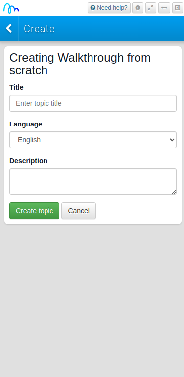
Fields explanation:

Title - the title of your Topic. It will also be visible to the end-user in the Widget.
Language - select a language for this Topic.
Description - enter a description; what this Topic is about.
- Click Create topic to confirm adding a Walkthrough.
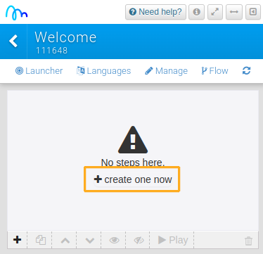
The Walkthrough is now added to your Site! Let's continue with adding steps.
Creating a step
- To add a step, click + create one now.
- You will see the Step Options panel in the Authoring tool and the preview of the step - the small popover in the middle of the screen. Start with selecting a step template - choose how you want your step to appear. The default is a simple text bubble.

If the selected step is properly displayed, you will see a green thumbs up icon. This icon is helpful to troubleshoot problems when a step isn't displaying.- Use the editor to provide a step name and your content: text, links, tables, images, videos or a slideshow.

Read more about embedding media in your steps in our Add media to your Topics guide and the WYSIWYG editor guide.
- The new popover appears in the middle of the page, not assigned to any element.
If you want to, you can assign it to a specific element in your application, such as a button or a form field. Click Assign element and choose to which element of your application you want to assign this step to.

If you want to remove the assignment, click the x button next to the Assign element button.
Read more about assigning Elements.
- After you assign the element, select the popover's position in relation to that element. By default, it is positioned at the top.

Here is an example of how it will look like.

- Choose a trigger you want to use to advance users to the next step. A commonly used trigger is the click trigger (a hand icon). When a user clicks an assigned element, it advances to the next step. If you don't want to use any trigger, choose x.

The default triggers in the step options panel will suit most needs, but you can also use the triggers panel for advanced control.Read more about Triggers.
- Continue with enabling control buttons to your step, such as next, previous or end buttons.

Available buttons:

Previous - this will add a previous button that will go back to the previous step.
Next - this will add a next button that will forward you to the next step.
Navigation - when disabled, will hide the next, previous and end button all at once. When enabled, will show the previous and next buttons if the action is available. There will be no previous button if there is no previous step.
Progress - when enabled, this displays the number of the current step, and the total number of steps. For example 2/6, is the second step of six total steps.
End - this will add an end button that will finish or deactivate the current Walkthrough.
Close - this displays an X close button which users can click to deactivate the current step.
Controls - if enabled, this will hide all the control buttons for that step.
All - this enables/disables all buttons that you have selected and will also disable the padding and the entire buttons holder so there is no additional space.
You can also add your custom buttons. Read more about custom buttons.
- If you want to, you can darken the area behind the popover. You can also add an outline. You can adjust the colour, opacity, padding and radius. The cover locks down the click-through tour, so your users won't get lost or distracted.

Read more about the Backdrop.
- If you need to redirect users to a specific location when a step is started, use the Misc panel. In Path, provide the URL you want your users to be redirected to.

Find out more about the Misc panel.
- Click the Save button to confirm adding a step.

Done! You just created a one-step Walkthrough!
If you need to add more steps, follow the instructions above for each of them. For your final step, we recommend using the end button instead of the next button, so your users can end the tour.
By default, when you add a new Walkthrough (or any other Topic), it will be listed in the Widget placed in the bottom right corner with the "Inline Manual" title. You can fully customize it or even hide it completely. Read more about the Widget.

Customization
Inline Manual is very flexible in making itself look exactly as you wish. You can fully customize the look of your Topics. Feel free to customize it so that it matches your brand's identity!

Here are a bunch of articles that will help you with that:
Customize the look - the player appearance settings
How to: create custom buttons)
How to: add animation (the Animations panel)
How to: add validation (the Validation panel)
How to: create custom step templates
Using custom CSS - Popover font, Class names
When to use Walkthroughs?
Walkthroughs are designed to get users to follow strict steps to accomplish a certain goal. Use them to guide users through tasks and tutorials. If you want to introduce something new from your website, which will require strict steps to be followed, this is the Topic type that you need. This is also the type of Topic to use if you want to create onboarding guides for new users or if you want to introduce updates or changes to your Site.
It's most likely that Walkthroughs will be the most popular Topic type you'll use with Inline Manual.
Let us give you some ideas!
Do you want to create a welcome message for your users when they login to the application? That's a one-step Walkthrough. Take a look at creating a welcome message for instructions.
Do you want to announce a new feature? That's a welcome message linking to a step-by-step tour. Read the announcing new feature tutorial to learn how to set it up.
Can you create a tutorial your support team can send to your clients in a chat? That's a multi-step Walkthrough possible to launch with a direct link. Learn more about Launchers.
Need more ideas? Look to these inspiring examples.
What's next?
Take advantage of the variety of Topics Inline Manual offers, and use the tool in other areas such as staff training or user support. Build Tooltips or Hotspots to draw users' attention to specific elements of your application. Create support articles to provide your audience with in-app help available 24/7. Learn more about the service you provide by asking customers for a Feedback
If you want to play your tours to specific groups of users, take a look at our Automation feature.
Get ideas for what you can apply now.